Wednesday, December 4, 2013

Counterbalance or Steel Yard Composition Stem

This one is a little over 6" x 4". Here I attempted to capture more of the true light of the scene. To that effect I did not use pure black. Notice that the medium dark mass of the slop and the small trees on the left counterbalance the dark shapes of the foreground tree. This is a well tested successful composition format.

End of the Tree Line 
Premium Tempera on hotpress watercolor paper

B & W Landscape Comps

Here is a set of landscape comps made with  Dick Blick's Premium Tempera as a substitute for the much more expensive Lukas and Utrecht brands. I used hot-press watercolor paper as a surface.To slow down drying time I use Vegetable Glycerin USP 100% pure. Glycerin also helps tempera to stay flexible.

These compositions are no larger than 2" x 2-1/4". The comps show their relative size to one another.

Doing black and white composition allows me to understand the relative values, identify the best composition  and potential problems in placement and size of the main elements. If the values are placed accurately, It also gives me an idea of the particular "light" of the landscape. 

Gouache and Tempera, unpretentious as they are, are a very sophisticated media, capable of very fine detail. They also are a good stepping-stone toward learning to paint with oils.

Saturday, November 16, 2013

Another Study

Here is a small Painting of a farm in New Mexico. Painting the foliage structure was tricky.


Oil on Canvas Paper

These winter scenes were painted on paper canvas. Personal collection.


Oil Studies on Poster Board


Testing Canson Board

This 6x8 was painted on Canson linen textured board.


Painting on Polyester Canvas for InkJet Printer

This was painted on a piece of 8x10 in. Polyester canvas. Very nice surface to work on and of archival quality. Primed with Liquitex Basic Gesso.


Experimenting with Dick Blicks Premium Tempera - Poster Paint


Here are a few landscapes done in gouache and Dick Blick's Premium Tempera (Poster Paint). I am amazed at the quality and concentration of the pigments. Great for doing studies.

Sunday, September 5, 2010

The Rule of Light Regarding Value Contrast

One of the properties of light is its intensity. The intensity of the light that falls on an object allow us to perceive the local color of the object and the range of tones of the color between very dark and very light. We use this property of light to determine the quality of the light. Because of this property, in order to create the illusion of light and shade is not only important to follow the rules regarding cool and warm colors but also to the rule of value contrast. The rule to remember regarding value contrast for a given color is:

"The lightest value of a color in the shadow is of darker value than the darkest value of the same color in the light "

So, it follows that "white is darker in value in the shadow than the value of black is in the light." Since the value of all the other colors (painting pigments) fall within the value range between black to white, we have a rule that can be applied effectively to create high-key paintings, high contrast and dark muted scenes.


This rule is very important when we are painting a sunny scene with wide dynamic range between the shadow and the light areas. In all cases we need to determine, before we start painting, the threshold values of each main color of the painting that will separate the "light family of the colors" and the "shadow family of the same colors". For example, in digital painting we would first create the color notan. This abstract placement of black and white shapes can be replaced by painting masses of the basic dominant colors in the scene. Placing only colors of the shadows family and of the light family. By following the value contrast rule: laying down the large masses of color in such a way that the darkest color that "lives" in the light would never be darker that the lightest color that "lives" in the shadow family. Please see how the value range rule is applied in the gray scale example. I also carefully selected the purple colors in the shadow that were exactly the complementary color to the red and orange colors in the light.

The point is that no matter how intense a given color may seem in the light, is never darker than the lightest value of the same color in the shadow. Notice in the color sketch that the family of reds in the light are never darker than any of the reds in the shadow. In this sketch the purple values are all at or below the Value 140 in the HSV (Hue, Saturation, Value) color model, regardless of the saturation.
City Sun. Digital painting made with Painter 11. 

Sunday, August 22, 2010

The Virtues of Realistic Painting

Leo von Klenze, View of the Valhalla near Regensburg.
My interest in painting and drawing started when my mother bought me an encyclopedia that included a short but excellent course in drawing and perspective and an expensive section about the history of art. I remember spending many afternoons after school trying to understand applied geometry to decipher the instructions to do drawings of stairs, columns and cubes in two-point perspective. I can also remember sanding pieces of wood to attempt my first miniature paintings with my inexpensive Tempera set. Years later, I moved to San Salvador, there while I studied English, I learned classic art methods with a few Salvadorian painters. In particular I enjoyed studying the techniques mastered by painters of the German romantic landscape period. Among the best of them are Joseph Anton Koch (1768-1839), Carl Fohr (1795-1818), Carl Rottmann (1797-1850), August Matthias Hagen (1794-1878), and specially Leo van Klenze (1784-1864) whose paintings exhibit a richness of detail and special attention to light and compositional space.

Ludwig Knaus, Girl in a field.
The German romantic landscape imbued philosophical ideas that go beyond the process of creating art. In a way they saw themselves as mediators between God and mankind, therefore one needed to have a religious inclination and divine inspiration as a prerequisites for producing art of true value. They were in opposition to the sweeping currents of rationality, art and intellectual development such as the Enlightenment. You can see in their paintings the reverence they felt for the creation. What characterized the German romantic landscape painting process? I could mention: outstanding draughtsmanship, all the elements of the painting fuse in light and space to become a unified realistic view of the world, and their ability to render architectural elements in harmony with natural forms.

Joseph Anton Koch, Monastery of San Francesco di Civitella.
The German romantic movement searched for, as several other romantics movements in Europe at that time, the ultimate goal of the artist, to create a personal representation of what is beautiful through mastering the technical difficulties and limitations of pigment based painting.
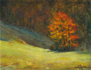
Jenne Farm, Reading, Vt
One of the most difficult things to achieve in landscape painting is the accurate rendition of light. This problems is akin to finding the correct combination of tone and color that evokes the artist's view of nature. Thus artwork is seen, not as an approximation to a photograph but as an personalized, filtered view of the intrinsic beauty of nature. In this way the artist displays his talent for sharp observation with an equal and complementary ability to improve upon the natural world by rearranging and enhancing it.

Here at the bottom, I have included the completed artwork I started in the previous post, so you could see my attempts to render a sunny day in the countryside using a photo of Jenne Farm located in Reading, Vt.
Enhanced by Zemanta

Monday, August 16, 2010

The Tools to Make Art

In this post I will give you a more detailed description of the tools I use for creating conceptual artwork which, in time, may become a complete studio work rendered in traditional media such as oil, acrylic inks, color pencils and watercolor.
Notan of the Color Image Below
Color Blocking Stage of a Painting
Digital Tool
HP PC with Vista Home Premium (64-bit). Running on a 5MB of memory. I work in front of a 22-inch diagonal display that is always set to 32-bit mode. All my line and color rendering is done with a Wacom Intuos 6 x11-inch tablet. Sometimes I use my HP CanoScan 90 to scan handmade drawings and to create new textures. For storing my digital files I use a 1 TB external hard drive.

Now to the digital painting software. As you know, because of the incompatibilities created by Windows Vista, many of the plugins in Adobe Photoshop, are not ready to run in 64-bit native mode. This has made it necessary for me to install Photoshop CS3 & CS5. I also use Nikon Capture NX2 and Corel Painter 11 for fine tuning the artwork.

Photoshop Workflow
I like to divide my workflow in terms of the creative stages in the painting. First I open Photoshop CS5 (64-bit) where I usually start with masses of dark color (the meta language of notan) and switch to textures brushes to establish mood and anchoring tones. Here I resolve most of the color problems of the painting using the ColoRotate and MagicPicker plugins.

Corel Painter 11 Texturing
New York Central Park
With Painter 11, I usually render the texture and background colors with a specific type of brush, such as Digital Watercolor, and proceed to establish the masses of color that will remain the underlying structure of the painting. In the example shown, you can see the watercolor texture in the background buildings. After this stage I prefer to switch to Photoshop CS5 to work in the critical stages of the painting.

Capture NX2 Fine Tuning
I use Capture NX2 in the final stages of the painting. At this point I am more interested in the global impact of the subject and if the elements "read" correctly. Here I adjust color, contrast levels and sharpness among other things.

Finally, I resize the file using Fractal Printer Pro v5 or Alien Skin Blow Up v2, for display on the web or for printing. If you have a comment or a question email me at carlosherrera700@gmail.com.


Enhanced by Zemanta
Add caption

Snow amoung the trees.